A great blog post is about more than just the layout.
It’s also important to pay attention to post styling and all the little details.
Such as the title, headings, sidebars, images, breadcrumbs, and more.
Don’t worry; I’ll go into more detail about all the various blog post layouts, examples of a blog post, and examples of content.
While these may seem trivial at first glance, they can make a massive difference in the success of your blog.
Throughout this post, one thing to keep in mind is that these examples are just guidelines, not rules written in stone for you to follow religiously.
Headline
A good blog post may take a long time to write, but the headline is one of the essential elements. A great headline should be short and exciting enough that it compels readers to read more with its promise for what’s inside. The following is the essence of an excellent headline.
- Make a promise.
- Draw a picture.
- State a fact.
- Ask a question.
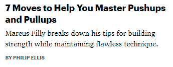
Look at the headline example below from Men’s Health. It promises to master pushups and pullups with ONLY seven moves!

Images
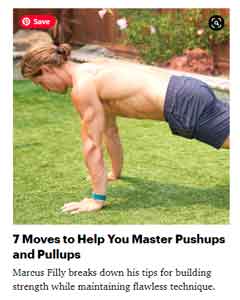
When you pair a great headline with an eye-catching image in your header, browsers are much likely to click through.
When people see something intriguing from their feeds, they are more likely to choose it from the thousands.
The post image is the first thing people see on a blog or website. Therefore, it needs to attract their attention and curiosity for them to read more of your content, much like the image below:

Typography
Arial is considered the web’s most readable font, but it isn’t perfect for every blog. In addition, it has some downsides, such as looking a bit too generic and doesn’t stand out from other fonts in many ways (i.e., being easy on the eyes).
To make your content more engaging to readers, you might want something that stands apart from others like Verdana or Helvetica Neue, which was inspired by classic Swiss design principles of neutrality and objectivity to represent modern-day aesthetics without sacrificing legibility.
Font size
Have you visited a website and had to squint your eyes to read what’s written? Here’s one example: The basics of font size
It makes for a bad experience don’t you think? Make sure your text is easy to read. And, check that it’s ok in all different viewing formats, ie. mobile, laptop, desktop.
Metadata
Like the breadcrumbs in a meal, the metadata should be worked into your design to avoid sticking out. This will ensure that people are not distracted from what you want them to see and focus on other aspects of your site, which may distract users away from returning or becoming brand loyalists.
Dropcaps
A drop cap is a letter at the start of an article that’s oversized, sometimes in different font and colors. This design technique captures readers’ attention from the beginning, which helps them engage with what they’re reading immediately. It’s prevalent on magazine covers or newspaper articles, but I think it should be more prevalent within blog posts!
Intro text
The lead lures the reader in by using larger font sizes and different styles of writing. Magazines use this technique to entice readers into their articles easily, often paired together with drop caps (the first letter at the beginning of an article).
Readers are unable to stop themselves from reading once they have been hooked!
Subheading
A good subheading is similar to an image within a post. It makes your content scannable by breaking up larger chunks of text and creating smaller sections that readers can process at once.
Subheadings should be styled so they stand out from other words to attract attention and break off into their category without being too overwhelming or distracting for readers who aren’t interested in them.
Breadcrumbs
Breadcrumbs are great for SEO purposes but not so much for design and user experience. You want the bread crumbs to blend into your site’s background.
Blockquotes
Blockquotes are used to display, you guessed it, quotes. Today, however, many websites like Buzzfeed have started using blockquote formatting to draw attention and get the reader’s complete focus on their post or article.
This is a quote
It is almost equivalent to shouting out something important in an essay which causes readership rates from scanning to drop substantially, giving them more time for reading content carefully.
This is a “pullquote”
Social
Convince people to share your content. Make the social sharing areas obvious and remind them. For example, I’m a big fan of sliding boxes in the left margin.
Comments
Once you’ve created a great post, it’s essential to encourage your readers to engage and share their thoughts. The number of comments, the comment form itself, and replies should work hand-in-hand so that conversations are easy for everyone involved.
Bullet points
- Break up your content.
- Make use of bullets.
Related posts
People often leave your blog without ever getting to read the posts they might be interested in. However, this can easily change by including related posts at the bottom of each post you publish on your site.
To maximize attention-grabbing and curiosity-inducing, make sure these include headlines for each related post as well as an accompanying image from that specific article or page when possible.
Author bio
The author section on a post is a great way to introduce yourself while making it easy for your readers to connect with you.
Call to action
Blog posts should include a call to action, like subscribing to an RSS feed or newsletter. A prominent CTA at the bottom of each blog post is ideal.
Every blog post needs a strong call-to-action (CTA) that convinces readers and visitors more about your brand/company story.
One popular type of CTAs for bloggers is asking users to subscribe via email – this should be the most visible part in every article’s footer section so it can’t miss anyone who wants updates from you on new content published.
Conclusion
Make your blog post as engaging as possible.
Try to use a compelling headline with an appropriate image, bullet points for easy reading on all devices.
By following these tips and examples, I hope you will be able to create a captivating blog post like never before!
You should spend most of your time focusing on styling your blog post because it is the area where you attract readers.
However, there are many ways to style these fifteen elements, and I hope this article has inspired you to start your blog.

As a dedicated SEO professional, I help businesses improve their online visibility and attract more customers through search engine optimization. Whether you’re a small local business or a large corporation, I can help improve your search rankings, drive more traffic to your website, and ultimately grow your business.
Christian Tanobey
